このブログは英語表記のみです。
What can you get out of this?
Well, first off, sore eyes?—is that image above messing with you? Does it seem like it’s twisting up on the right side? Sorry for the weird optical illusion.
Anyway, continuing onward, if you have even the slightest interest in what Japanese graphic and package designers are up to these days, you’ll find value in the selection of works and photos included in this post. Who knows, you could find a new direction for your latest project. Wouldn’t it be cool if you were able to say, “This piece was influenced by a modern Japanese design aesthetic.”?
Every year, JAGDA (Japan Graphic Designers Association) compiles all the best and brightest work from the previous twelve months and prints a book of notable Japanese design. In essence, this hardbound bible of Japanese creativity is the “best of” here in Japan. A flip through the book shows you that it’s not just a flub-loaded washed-down waste of space, but a full-on image-focused manual of design delights. To sweeten the deal even more, the book even rings in at the humble pricepoint of 15,750 yen (US $190).
*cough cough
But hold on! To add value to that pricepoint, there are a few things to consider. First off, the book is in Japanese and English allowing it to be a much more internationally applicable work. Also, being developed and published by the design entity for Japanese creatives, you’re not running the risk of emptying your wallet in vain. The content is quality.
The Event
So recently, I had the chance to check out the event at Design Hub here in Tokyo Midtown (for more info about these two places, check out last week’s blog about art havens). While roaming around the gallery, I managed to snap off a few shots of posters, packaging and one special product that’s been creating a lot of online buzz lately. (stay tuned for that one. It’ll be the grande finale).
Below I’ve posted a few of the images to give you a little taste of some of that good stuff! Enjoy!
Awesome Posters
Yusuke Ono
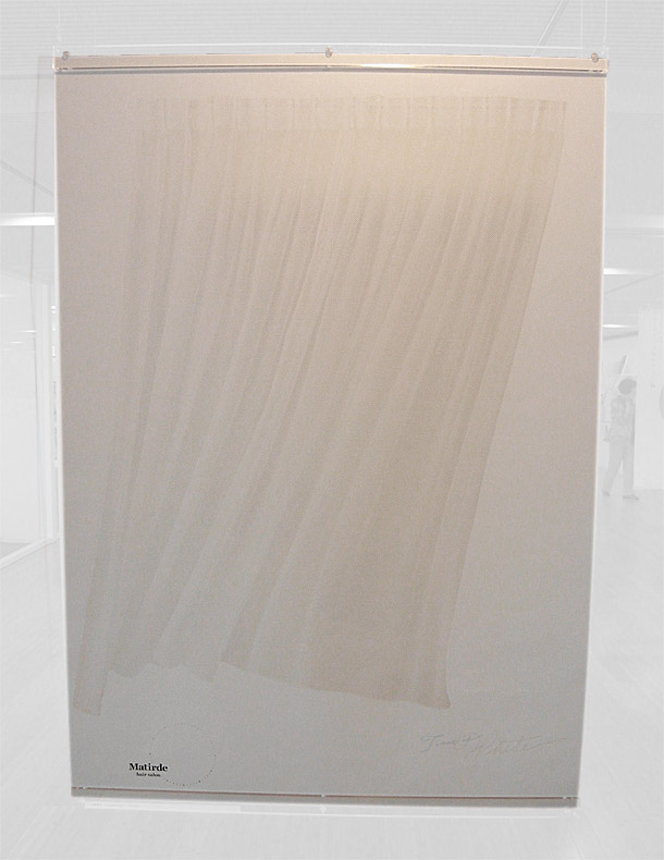
Can you guess what this poster design is for?
That’s right! A hair salon.
Ohh, you didn’t guess that? Neither did I at first, but the image of a curtain softly billowing in the breeze and the visual you get when a woman’s hair blows equally as softly, are undeniably similar. I really love how the lines in this poster are so simple, natural and obvious yet somehow carry great dynamic. The perceptive depth from the bottom-left edge is great.
As if this wasn’t enough, the designer decided to add to the “wispy” and “soft” nature of the curtains/hair by doing something else. Something radically unique:
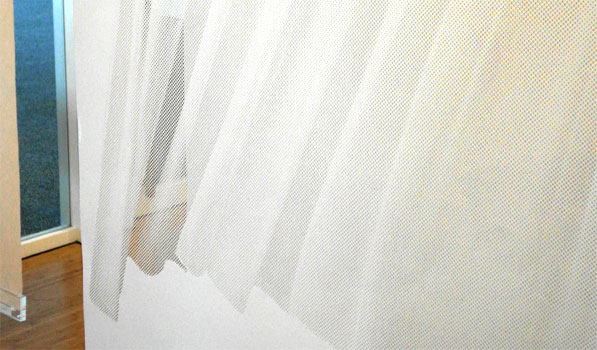
On first glance, it may just look like this poster is a simple background-removed photo printed on a white backdrop. Look closer and you can see that portions of the area are transparent. This wasn’t done through varying thickness of paper (though that would be neat as well), but rather through circular dots cut out of the paper.
In the image above, you can see the wall beyond through the poster. Neat.
Similar to halftone screening, the individual dots vary in size and spacing. Areas that have had more paper removed, seem to be deeper shadows. Smaller dots or more sparse spacing result in lighter shadows. Overall really cool to see up close. Wouldn’t mind getting a copy of that one.
Yoshihiro Yagi
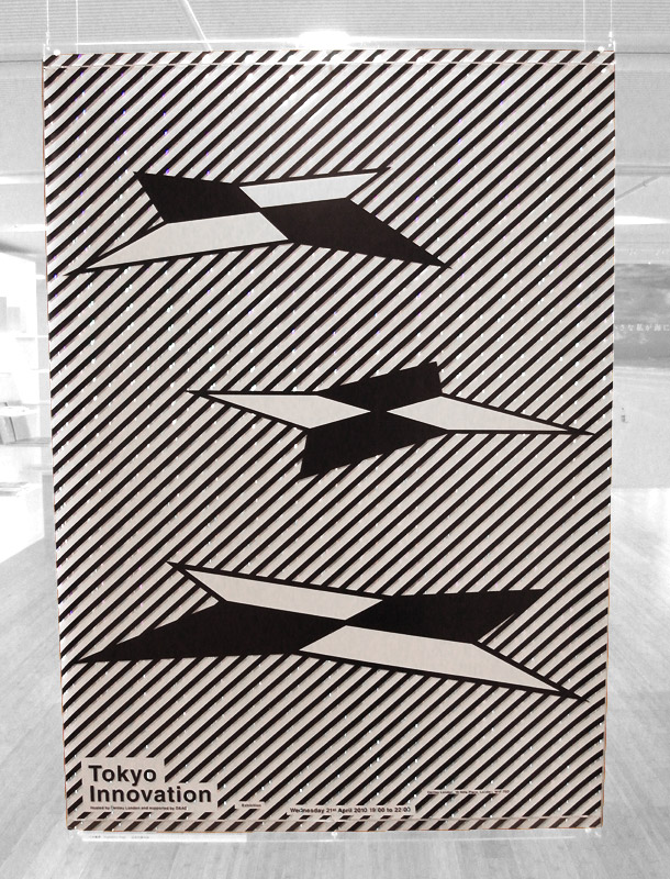
This design was really dynamic, bold and clean. I admit, it looks a little bit eighties to me but a lot of design (and fashion) seems to be reverting in that direction lately.
What’s really neat about this one is that each diagonal black stripe is paralleled with another thin stripe of holographic paper. This reflective paper adds an intense sparkle to the piece, adds a variety of color and allows you to reminisce about what your bedroom walls looked like when you were living on a space station as a kid.
Perhaps you can get an idea of that “sparkle” from the photo. See those little pinpoints of light? Those are the holographic strips in action.
Ken Maruyama
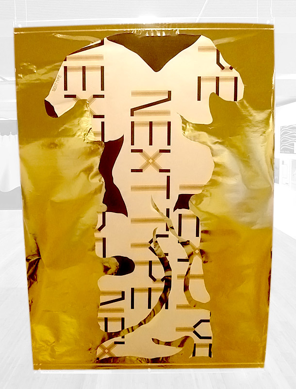
This one nearly gave me a headache. Talk about bold. I could see this thing from across the room even when it was hidden behind other artwork. Again, a unique printing/processing technique like the two listed above.
Nexttype is a typeface brand and this poster is an advertisement for it. I wonder how well this worked for marketing. Does this inspire you to learn more about the product?
Mitsunori Taoda
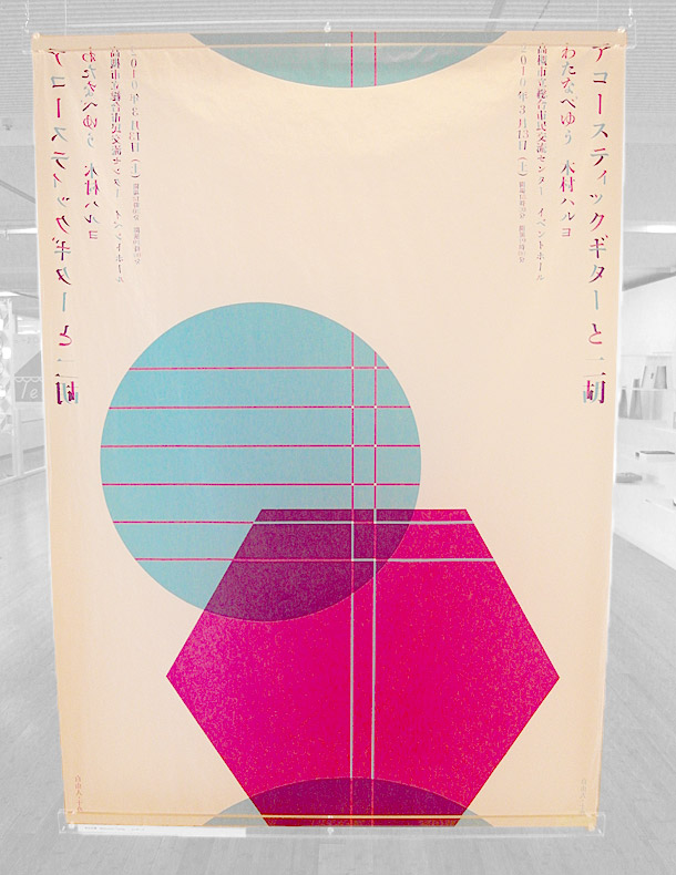
This poster was done for an acoustic guitar concert. What struck me about this poster was the typography. Each character is comprised of different colors from the shapes below. It resulted in a really interesting type treatment.
Obviously the shapes below are a reference to instruments as the circular shape has white lines laid across the top (guitar soundhole?). The hexagon has two lines. What could those be?
Awesome Packaging Design
Junya Kamada
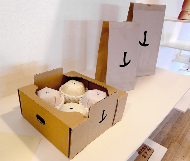
As if you thought that Apple had done all the world could do with branding an apple and effectively keeping it simple, here comes Junya with a clever approach to the apple that you may not have thought of.
The stem and the pocket
Simple, recognizable and clever. Is it just me or does it look (style-wise) like he was influenced by Amazon? It’s hard to shake that correlation, don’t ya think?
Awesome Product Design
Rikako Nagashima
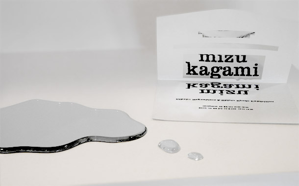
Mizu Kagami is the name of this product and it’s a bit difficult to explain so bear with me:
Mizu = “water”
Kagami = “mirror”
…I’m exhausted.
Anyway, I thought the concept was clever and the packaging even more clever. My only question is why Rikako used rectangle-shaped reflective paper on the package instead of puddle shapes. I think it would have been nice to tie the soft fluidity of the mirror and the packaging together.
Either way, a cool concept in that you need to look into the reflective paper in order to read the words which are printed (traditionally) on the bottom flap, in reverse. I had a hard time reading the fine print though. Could have been a more user-friendly design if she’d put the smaller text in the usual left-right manner.
Masashi Tentaku
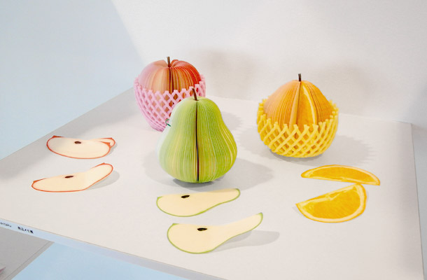
Kudamemo (果メモ)
Allow me to over-exert myself again here.
kuda = “fruit”
memo = “memo” (…)
I’d seen these things online but they weren’t quite as cool as seeing them in person. pull out a slice and write a memo. Very clever and fun. It may lose a few points on the function side as you couldn’t write much on those litle sheets of paper. Each memo pad is just about the same size as their respective fruits. I still haven’t seen the orange online so that was really cool to see. I guess it’s good to have the inside scoop sometimes!
I think it’s great that they come wrapped in the little stretchy foam nets that you often see in the grocery stores. That’s classic.